
Wednesday, 22 April 2020
final poster
This is the final poster that I created. I used different blushes to blend some colours and add a textural element to the design.

Tuesday, 14 April 2020
Covid 9 poster greyscale comp
For the greyscale comp I have decided to make the the importance of the Earth and having clean hands stand out more. These are more important than the virus particles that are lingering in the background that make everyone on earth sick. Therefore I have made the hands, earth, and soap a lighter value. The virus particles are a darker shade and fade into the background.


Wednesday, 8 April 2020
Covid 19 poster thumbnails
I have been tasked to design a Covid 19 poster as a way to inform people about prevention about the virus. My Designs include using the idea of having the virus visually spreading across the design. Another concept shows a woman coughing and the virus spreading. Info is including in the virus bubbles. An additional concept would be more of a collage of prevention methods with small pictures representing the text. My Final design shows hands wearing holding the globe wearing a face mask. Soap suds and bubbles represents how keeping the world clean will protect it. Virus particles around the globe are blocked by the soap. The captions says wash you hands with soap and water for at least 20 seconds.


Tuesday, 31 March 2020
revised Concepts
I have decided to change the shilhouettes to a lighter colour instead of black. This will allow the officers to appear more friendly. I have also decided to give then smiling faces as well. The city skyline was made smaller. The tower was changed to blend in more with the skyline to appear less important compared to the figures. I have also decided to add more detail to the skyline. The phrase at the bottom is the most important message. Therefore I added a small white stroke outline to emphasize the words.


Tuesday, 17 March 2020
Storyboard 2 colour version
I have colourized the the final story board. I created a separate layer for the colour, the highlights, and shadows in each frame.


Thursday, 12 March 2020
Storyboard 2
In class we are tasked to create a 6 frame story board based on a a game, show, or movie. I choose to draw a scene from a Chinese drama that is about a school that specializes in athletes. The storyboard below depicts 2 strong female athletes from the school in a kick boxing match.


This is the start board planned for the greyscale thumbnails. Each frame will follow this sequence.


The follow frames were created using screenshot references of the match from the drama. I created the outline sketch on its own layer and then after went back with a second layer for the greyscale. This will help me determine where all the lights and darks are portrayed in the image when I create a full colour storyboard.
Sunday, 8 March 2020
Colour Composition
This is my colour composition that I have created. I choose to have the officers silhouette over the city as if they are looking out over after the city of Toronto. The skyline I choose to have pattern that represents glass of buildings. An additional text element is added in the suns rays of a possible list of jobs as a reference from the headline "one career, many opportunities". The colours I have choose are blues and orange since they are complimentary. The silhouettes are left as black to add contrast against the bright background.


Tuesday, 11 February 2020
Sketches
sketches
Digital illustrations for the Toronto Police Services recruiting program.Here are a series of brainstorm sketches.

Digital illustrations for the Toronto Police Services recruiting program.Here are a series of brainstorm sketches.

Story board finish
My finished storyboard all 4 frames.


My process for each frame was to create the line art first then put in the solid colours on a new layer for each object. Next I put in some shadows on a new layer. Then the highlights on a new layer. Even the type for the bottle has its own type layer to make it readable. My process example follows as below in the pictures.


Tuesday, 4 February 2020
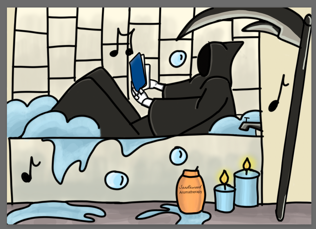
storyboarding
In class we were given a story board that we could recreate. This was the original storyboard for me to base the grim reaper on chilling and relaxing at home. Just making him into a bit of a funny joke.

I choose to redraw some on the scenes elements to lead the viewer to the revealing of the grim reaper at the end. The grim is not fully shown to add to the comedic effect at the end when all these habits are revealed to be on the grim at the very end.


I choose to redraw some on the scenes elements to lead the viewer to the revealing of the grim reaper at the end. The grim is not fully shown to add to the comedic effect at the end when all these habits are revealed to be on the grim at the very end.

Thursday, 23 January 2020
Digital painting
For my first digital painting done with using the reference below. This portrait of
a woman in done in grayscale. This post will explain and show the process of how I digitally painted the piece from start to finish.

First I opened the reference up in Adobe photoshop and created and named the reference on its own layer. I turned down the opacity of this layer so I would be able to do a line art sketch. The line art sketch is done on its own layer. The line art is done to have a general sketch of what you are painting.

Second, I took a a large size brush to paint in the some ground on its own layer. I choose a charcoal brush to achieve this textured effect in lightly laying in some on the darker and lighter areas.

Next, I created a values layer to to paint in all the darker values in the portrait. I had the opacity for the brush down low and would adjust it depending on how dark I wanted a certain area to appear.

Then I created the highlights layer to and painted in the textural details of her sweater, hair, hat, and face. Again I adjusted the the opacity of the brush many times. I had to switch between painting in the darks and lights to achieve the look I wanted. Lastly, I removed some of the line art. Removing the outlines that were showing through it allowed the highlights and shadows to shape her face. An example of this would be her lips.

Wednesday, 22 January 2020
Sketches for Illustration Friday
Last weeks word for "Illustration Friday" was family. This online platform allows illustrators to practice their skills and create something based on the word of the week. I decided to create sketches of a potential movie poster. Below are 4 potential thumbnail compositions sketched out.


When sketching these compositions I didn't want to choose a stereotypical approach to the word "family". I decided to choose a darker theme. I intended the sketches to be depicted gory with the use of dripping blood. The four siblings are shown that competing for the throne are shown, but the main female lead is larger. The death of the king can be interpreted through the empty throne or funeral.
My inspiration for these sketches is a book that I read when I was 14. Unfortunately I cannot remember the proper name to research the book cover. The book was about a maid that is top spy for the queen. She must do what ever it takes to protect the queen at all cost.

Above is my first attempt at sketching digitally with my new Wacom tablet. I choose this design to sketch because I thought that is was the better composition. The girls enlarged head and crown at the top draws in the viewers eye. The dripping blood from the crown moves the viewers eye down through the composition to the bottom of the composition.
Tuesday, 7 January 2020
Other Platforms!
Other platforms my work can be found on!
Accounts
- flickr: https://www.flickr.com/people/186365681@N02/
- Instagram: ashley_ubilla_design
Subscribe to:
Posts (Atom)